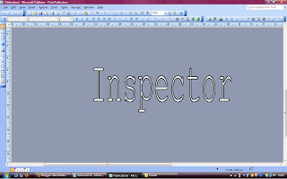
For the font of our title, we wanted a reasonably unknown font, that matches what the title is about. The word "Inspector" connotes unknown, and perhaps makes people think of things like Sherlock Holmes and a degree of unknown. This similar effect is reflected in professional films. Examples are Horrors, which often have dripping style font to connotes the dripping of blood or a similar style like that. This is used in horror films like Fright Night (2011, dir. Craig Gillespie) Thrillers fonts aren't as obvious, as the thing that makes Thrillers what they are, is the suspense and aspects like that. Which can't be put across through a font. Most fonts for the titles in Thrillers, are clear sans serif fonts or are match the to the theme of the film. Examples of this are below.
Super 8 (2011, dir. J.J. Abrams) Thriller Image from http://www.imdb.com/title/tt1650062/ |
 |
| Psycho (1960, dir. Alfred Hitchcock) Image from http://www.imdb.com/title/tt0054215/ |
 |
| Fright Night (2011, dir. Craig Gillespie) Image from http://www.imdb.com/title/tt1438176/ |
 |
| Inception (2010, dir. Christopher Nolan) Image from http://www.imdb.com/title/tt1375666/ |
Inspector- Courier New, 116pt
We went through every font allowed for on the iMovie software and we decided on Courier New, 116pt, as it seemed fitting to match the title. It also produced a sort of old, typewriter feel, which incorporates the Film Noir aspect to it. we wanted a slightly unusual font here, one that you wouldn't use for just ordinary text, as this is the title and the font should reflect the genre and styling of the film.
For the credits, we wanted a simple font that was easy to read, but not easily recognisable so that it would make the production look unprofessional. These are the main reasons for choosing this font. It is not over used, likes fonts such as Times New Roman and Arial but has the same sort of effect of a usual sans serif font.
 We thought it was a good idea to put the surnames of the credited in capitals because this is a technique widely used within film making, and helps distinguish names in professional films to avoid confusion. It also grabs your attention to the name slightly more, making them stick in your mind, which is important for professionals, to be recognised for their work.
The images here, are the same as the fonts used in our production, but the style may differ from these images to the production because these have been generated from a different program, which allows for different styling to add to the font and is on a PC, opposed to a Mac, which may also affect the styling differences.
The sizes in these images are also differed to the size the fonts are in the production. In the production, the title is that big, as the title should take up all the screen, and 116pt is the largest font we could use that allowed the word to stay onto one line. We considered having the title across two lines, or breaking it into two nonsense words, such as 'Insp' and 'ector' but after experimenting on how these looked in the production, we decided that the most professional looking way of showing the title, is simply one one line, which left the sizing as 116pt.
 We decided to use a different font for the 'and' between our names in the first directors credit, because when this was the same fonts as the names, it looked boring and unprofessional. We decided to make the 'and' slightly larger and a more elaborate fonts, when finally deciding on Signpainter, 38pt, which is six sizes larger than the rest of text. It also links the two names together and draws your eye to the credits, without being too distracting as there is only a little of elaborate fonts. This font wasn't present on any computers except the Mac, but I did find it on a website to show the font. Which is screenshotted right. The URL of the website is
[http://www.azfonts.net/load_font/signpahc.html]

In the production company logo, the font cannot be changed from Times New Roman, neither can the size be changed, Which is why this font differs from the usual ones we used, and may look slightly out of place. We tried changing the other fonts to match this, but didn't like the result it give. We then also realised that a distributors logo would be the same for different films, so the changing of font from the logo to credits would be different anyway.


No comments:
Post a Comment